 I often see maps of Indian territories pop up on the net. I like them. And then again, I don’t. I’ve seen also some of these same maps in classrooms and academic papers. In such cases, the narrative usually does a bit more to put the visual presentation in context, but on the net, that visual is often all you get.
…along with a couple hashtags, and sometimes a catchy title.
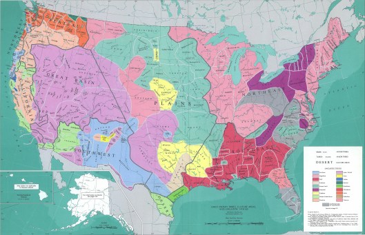
The specific subject matter varies a bit from map to map. Sometimes they purport to show linguistic variation. Sometimes, they show the culture areas used by anthropologists or the general divisions of Native American peoples into related peoples. Mostly, these maps purport to show the specific locations of various tribes.
…whatever that means?
Don’t get me wrong. The basic idea isn’t entirely off base, and it’s a lot better than silence on the topic, but the notion of an Indian tribe carries a lot of baggage, only some of which goes away if we replace the term ‘Indian’ with ‘Native American’. We can also replace ‘tribes’ with ‘nations’ or ‘peoples’.
…we still end up with plenty of baggage.
There really isn’t any vocabulary that just works here. You really have to pick a term, and just bear in mind the distortions it imposes on the subject matter. But my point here today isn’t so much to work over the vocabulary as it is to focus attention on the maps themselves. It’s great to have them, but they too can distort the subject matter, all the more so when the map circulates as a meme-in-in-itelf, so to speak, just an image without a narrative to go with it.
So, what’s the problem?
***
Well, we have a few of them actually. One of the first things going through my own mind is the other half of the contextualization schema. The maps give us a where. That leaves me asking when? These maps purport to show us where different Native American peoples lived, but they rarely give us a strong sense of when they lived there. This goes hand-in-hand with common assumptions about the timelessness of Native American societies. Folks are only too happy to imagine that most Indian peoples had been living in the same place since time immemorial, just waiting for the rest of us to show up and kick-start the history machine. All the timely-changey stuff must have come after Columbus, so the thinking goes. Before that, Indian peoples just stayed put, living in harmony without any real need for big changes like a major population movements.
All of this is of course, nonsense, and I think most people know it is, at least when the question is put to them directly. I repeat, they know it WHEN you put the question to them directly. Until then, I think folks fall quite easily into the assumption that Indian peoples rested in a kind of temporal stasis. Hell, sometimes Native Americans themselves fall into this assumption.Don’t be too surprised. Stereotypes often come in a user-friendly version, an ever-so-inviting role to play, for those who are willing. The noble savage may be a cliché, but it’s not one without its charms, and it’s easily as timeless as any of its less PC counterparts. In any event, folks often seem to imagine Native American societies as timeless communities.
Case in point?
These maps.
 I found this little gem to the left on twitter, at least I believe that’s where I got it. It’s pretty cool, really. It definitely matches my general sense of where various people should be. But then again, my general sense of where everybody should be rests on a skewed timeline. I expect them to be in certain places when the stories I read or tell about them in history class take place. So, if the different natives peoples are in the right place on cue for the historical narratives I expect to feature them, then the map matches my initial expectations, and I end up saying stuff like “it’s pretty cool.” The whole thing almost works, but it doesn’t take too many questions to bust up both those expectations and the maps that go with them.
When did everyone get where they are in the map above? It’s controversial question, and one that I may regret raising here, but still… See the Apacheans down there in the Southwest? You might think they had been there since time immemorial, right? Well the archaeological evidence suggests this isn’t the case. As I recall, the earliest evidence for Diné (Navajo) placement in the four corners area predates the Spanish by a little over a hundred years. They came along with the other Apachean peoples by means of a hotly debated route. Of course archaeological finds happen every day, so the historical evidence may change, and I may have missed a recent find or three, but the point is that these people arrived in the area within comprehensible time frame. This placement on teh map isn’t from time immemorial; it begins at the cusp of the 1400s, give or take a bit, and that enables us to place their entrance into a sequence of events for the region. They were still settling into the total territory on this map when the Spanish began exploring the region, arriving well after their Pueblo neighbors. Knowing that helps to put the map in perspective. Not knowing that invites an a-historical reading of the map.
Now look at the plains. The peoples placed there seem right to me, but it’s worth considering that many of them didn’t get there until well after the beginnings of the colonial period. Specific migration routes and the scale of ground shifted are of course open to debate, but I think it is fair to say that a great deal of the population on this portion of the map filled in after the beginnings of the fur trade, and even more importantly, after the horse began spreading through the plains in the wake of the Pueblo Revolt.

From the New Mexico Museum of Art
That would be a war the Indians won folks, not simply a battle. a war. But that’s another rant…
…anyway, the point is that the population of the plains as we now understand it changed a great deal during the colonial period. So, if the southwest takes on roughly the territories represented in the map just ahead of the colonial period, the great plains takes its apparently map-worthy shape during that very period. We can point to a time frame sometime on down the road that reflects this mapping, but by then other things have shifted. Case in point? The eastern seaboard. By the time the plains looks like it does on this map, the settler population is already pushing a lot of people out and away from the coasts. By the time Lakota, Comanche, and Kiowa have reached their positions on this map, the eastern seaboard should already be looking a bit white-washed.
These are just the areas I think I know something about (and admittedly, I am often wrong). The rest of the map is full of movement too. Some areas may be more stable than others. The amount of movement is itself variable.
So, what does the map represent? It really isn’t a clear snapshot of any particular time-frame. We really can’t locate a specific time in which all the territories assigned to various indigenous peoples really were under their control. Rather, it seems to be a representation of the territories controlled by various peoples during something like a period of peak cultural autonomy. …as perceived by white people. In a very real sense, each of these territories is set onto the map in precisely the locations at which we non-natives really became interested in the regions and/or first became aware of the native peoples in question. Fair enough as far as it goes, but to say that this leaves out a lot of information is a Hell of an understatement.
***
Speaking of non-native perceptions. Names are a bit of a problem here as well. I hope it will come as no surprise to learn that many of the names appearing on these maps are not those used by the people to refer to themselves. ‘Navajo’ was for example a Tewa term for open fields. ‘Sioux’ is usually described as a shortened version of an Ojibwa term (it has something to do with snakes). As I recall, there is a competing narrative for that one, but the point is that the name DID NOT come from the Sioux themselves. ‘Eskimo’ was a Montagnais term often translated as ‘raw fish eater’, though it is more likely to have meant ‘snow-shoe netter’. Each of these origin narratives is a complicated story in itself (information is problematic all the way down), but for the present, the point is that the names typically appearing on these maps generally come from the neighbors of the peoples in question. They made their way into the popular lexicon after European colonists asked some other tribe who lives over there. The answers to those questions then made their way into our history books and onto our maps.
 This is one reason I like this map by Aaron Carapella. He makes an effort to identify the native names for themselves and get them onto the territory. That’s a big improvement. Of course, we still have the timeline problem mentioned above, but at least the names are a bit more authentic. I should add that they are more authentic because they are the names the people in question use for themselves, not because they are ‘original’, as folks sometimes suggest. ‘Original’ alludes to a timeless beginning. Talk of an original name just points us back to the timeline problem, but there is definite value in using the name people prefer to use for themselves. We may have to switch back and forth, or introduce a topic using the more popular names, but working with materials that provides the native terms helps to normalize them.
***
 One additionally interesting feature of Carapella’s maps is the fact that he leaves off the territorial boundaries. The names of each people simply appear on the map without any clear sense of the boundaries around them. We are left to imagine the full extent of each native territory. This avoids one of the larger problems one commonly finds in maps of Indian territory, their tendency to construe that territory in terms comparable to that of nation states. We all know the convention, color-coded spaces with clear boundaries between them. This conveys both a sense clear boundaries between different Indian peoples and a sense of homogeneity within those boundaries. Every part of Cherokee territory on such a map is just as Cherokeeish as any other part. They are all equally blue, or yellow, or mauve. One gets the sense that someone could pinpoint the exact moment they stepped into (or out of) Cherokee land, or that of any other tribe. We can practically see someone stopping on a dime, just like the cops in an old outlaw trucker movie do when they reach state lines. That’s how modern nation states work. It isn’t clear that this is now native territories work(ed).
It isn’t that native peoples didn’t have territories. They certainly did claim specific lands, and even defend them from others, but this system would have worked without the benefit of a scientific grid defining the exact moment one would step over the line from one territory to the next (much less collection of maps to represent them). Of course, natural features such rivers or mountains, and so forth would be used as reference points, but thus too leaves open questions as to just where the boundary rested. Did a given people claim both sides of a river or just one? The answers would vary. The end result was of course a lot of overlapping claims.
I often wonder if some of these maps could be improved by representing the overlapping territories, Venn diagram-style, at least where such instances do occur, but of course, this leaves open questions about timelines and the adequacy of information as to how the territories on these maps have been assigned to begin with. It’s not as though the historical record is entirely silent on these matters, but there is something about the way these maps fill in the details with a little too much precision. Judgement calls have been made on these maps, and the way they have been made is erased by the nature of the maps.
The problem isn’t really unique to Native American territories, but at least as applied to modern states and nations the techniques used by the map-makers matches those of the powers that be a bit more. People who live in and around important boundaries may or may not live life in a way that bears out the conventions of cartography, but the powers that be will likely support the notion that we can pin-point exactly where one state leaves off and another begins. They will also support the notion that we know exactly who belongs on one side or another, if necessary with guns or walls. The trouble here is that these maps purport to describe the territories of a different world altogether, one which reckons turf a bit differently.
Don’t get me wrong; it’s great to have these maps, but they distort even as they inform. I’m always curious about the prospects of improvement. In the interim, I reckon the best cure for the distortion is to be aware of the problems.
…of which, I hope I have at least scratched the surface.
Sundry Maps (Click to embiggen)…

California Indian Territories

Indian Tribes of the U.S.

Aaron Carapella’s map

North American Linguistic territories

Territorial Losses (ironically Native American territories become more clear as they shrink at the onslaught of colonism

Culture Areas Again

Culture Areas

Nuther Aaron Carapella map

AK Natives


 If you are traveling around the four-corners, you might think your best bet for a map would be one covering one or more of those states.